The Ohio State University | Intermediate Visual Communication Design 2 | Spring 2023


Project Roles
Giulia Blake | Illustrator File Management, Printing & Assembling Prototype, Design Iterations
Bekka Ranalli | Research, Class Presentations, Design Iterations
Lucy Vidmar | Printing & Assembling Final Prototype, Class Presentations, Design Iterations
Description
In this project, we experimented with "informational packaging" that seeks to provide users and consumers with more detailed information about the product beyond just its branding elements and basic features. Our group chose to focus on supplement packaging.
Process
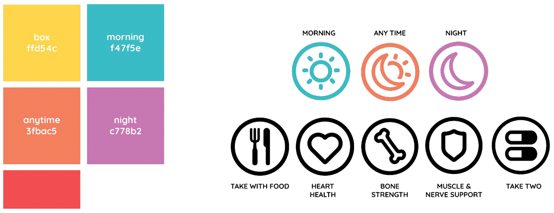
The project started with concept development for applying data visualizations to enhance packaging. Before we started ideating, we identified the following information.
Who is it for? People who take daily supplements and/or are annoyed with the excess packaging for supplements
What information is conveyed? How much to take on a daily basis, when to take it, what its purpose is, interactions it has with other medications/supplements
How will it be conveyed? Print, color coding, icons, graphic elements
Once we identified the scope of our project, we started to iterate visuals and structure for our packaging.
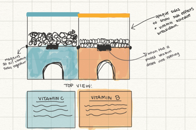
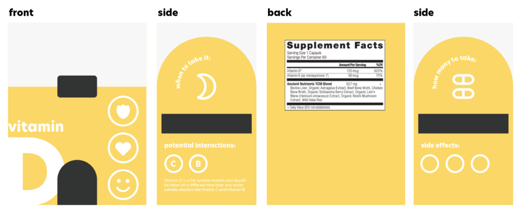
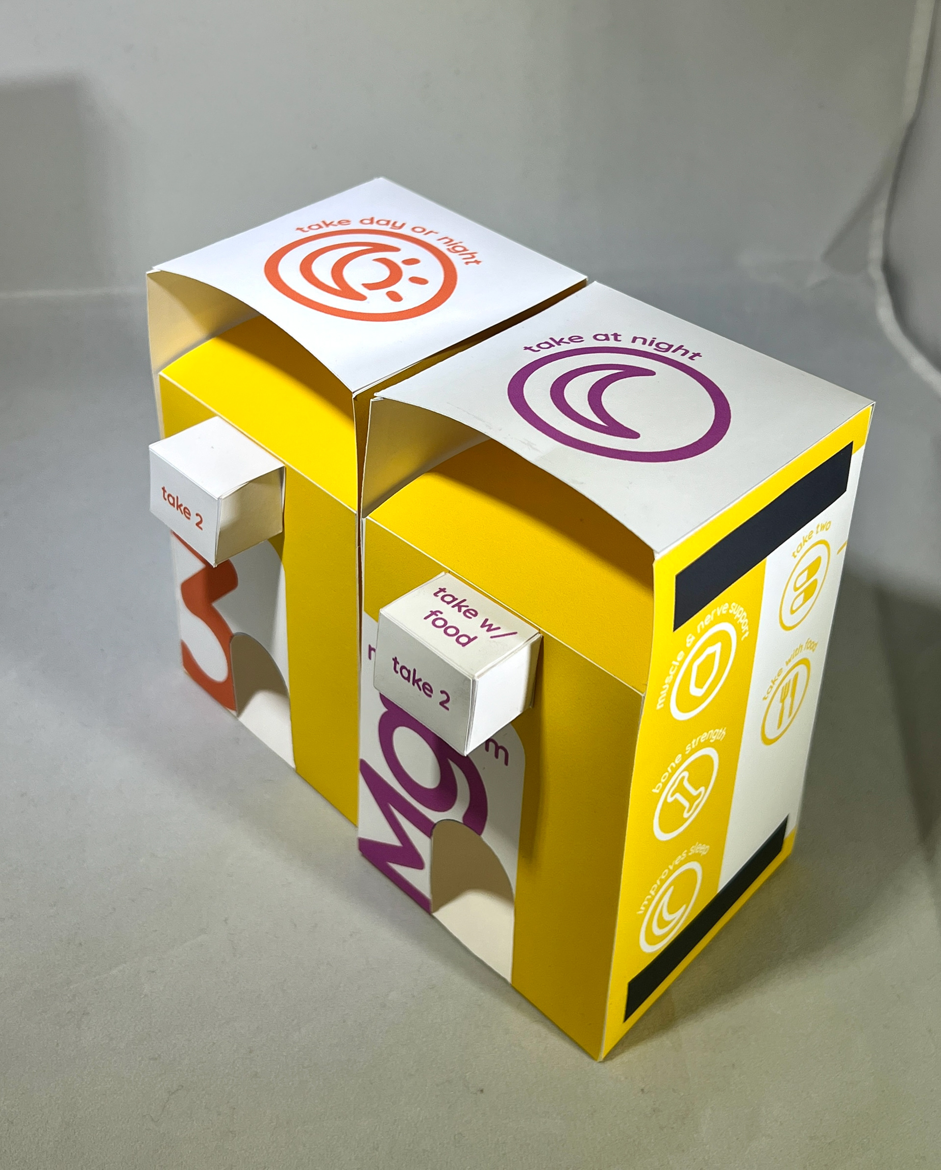
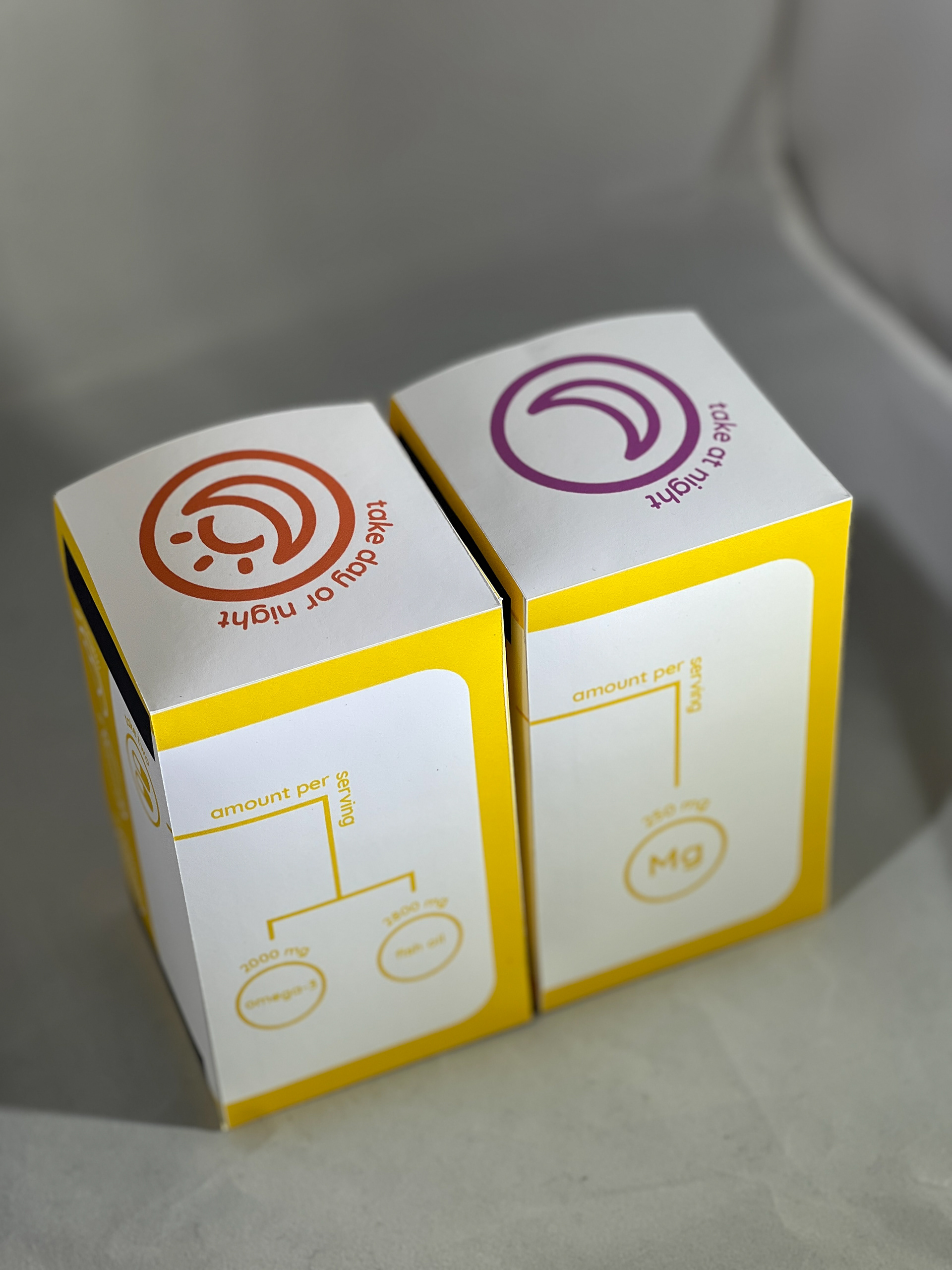
We also created a system that would be used across any other supplements that would be included under this "brand". For this project, we only built prototypes for two supplements: omega-3 fish oil and magnesium, but we designed the packaging in a way that could be applied to a full series offered by a supplement company.
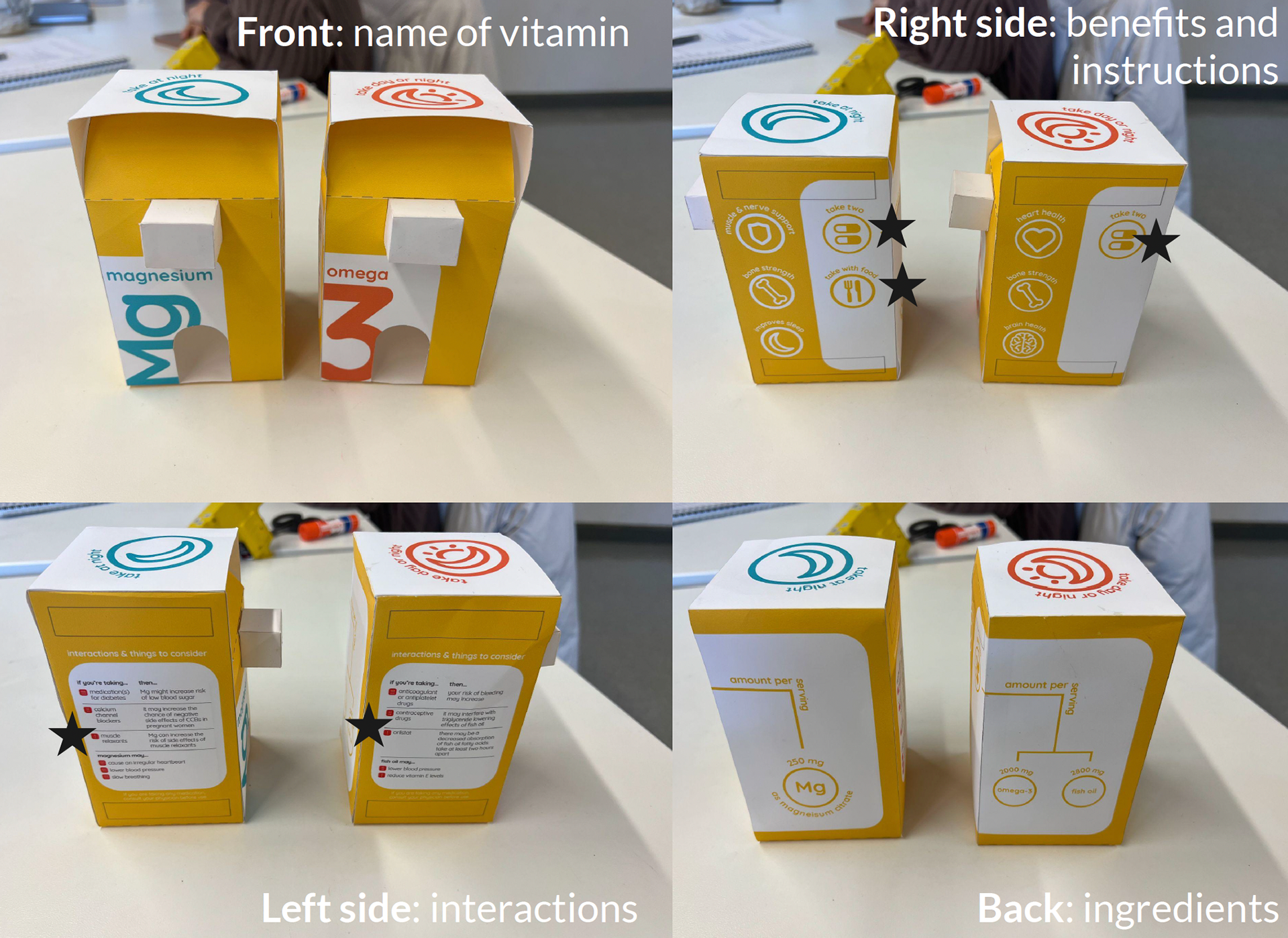
First Prototype
We learned a lot throughout the development of this project. Our biggest challenge was deciding where information to go based on how the user would interact with the packaging, specifically how many supplements to take and if it needs to be taken with food. We solved this issue by placing that information on the pull-out tab, as well as the side, so the user would see it right as they go to retrieve their supplements. We also faced many challenges with the interactions section. It was very difficult getting the information to fit on the side, look nice, and be easy to read.
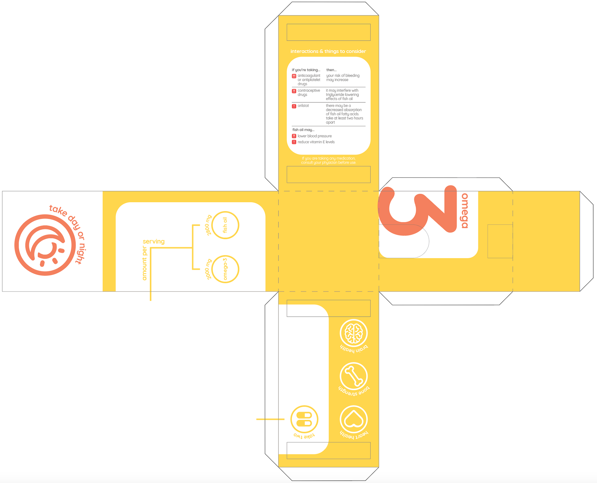
Omega 3 Net

Magnesium Net
Reflection
We learned a lot about packaging design throughout the development of this project. If I were to continue this project, I would test the packaging on non-designers to see how intuitive the design really is. While we had multiple critiques in class, seeing someone interact with your design in the setting it's meant to be used in would have provided us with a lot more insight into the data visualization methods we chose.