The Ohio State University | Design Media 1 | Autumn 2021
Description
For this project, I implemented motion as a means of communicating and extending the essential qualities of a redesigned brand mark for Spotify. There are two different animations of the new mark. One exhibits an expected motion, or how a viewer might anticipate the identity mark to move. The other, an unexpected motion, is the opposite and surprises the viewer.
Expected Animation
Unexpected Animation
Process
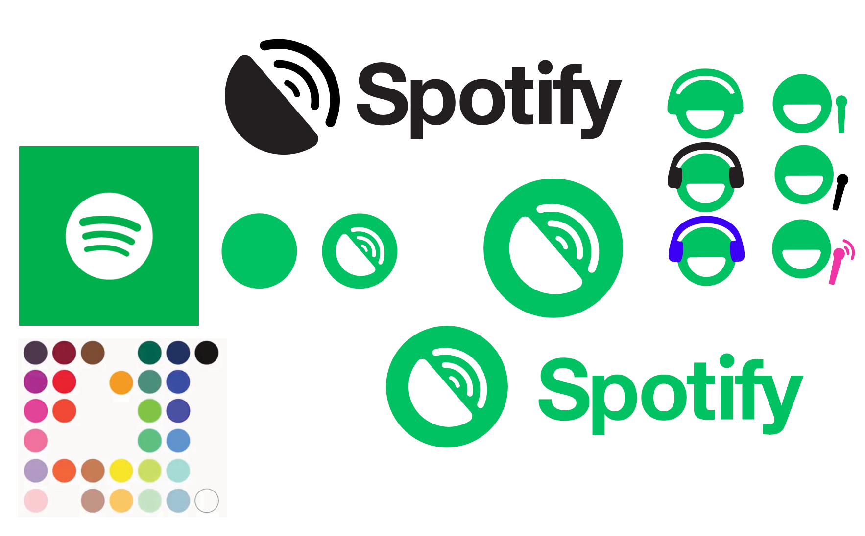
I started the project by iterating potential new brand marks for Spotify. I wanted to remain true to the current brand so I kept their signature green, black, and white.
Brand mark iterations
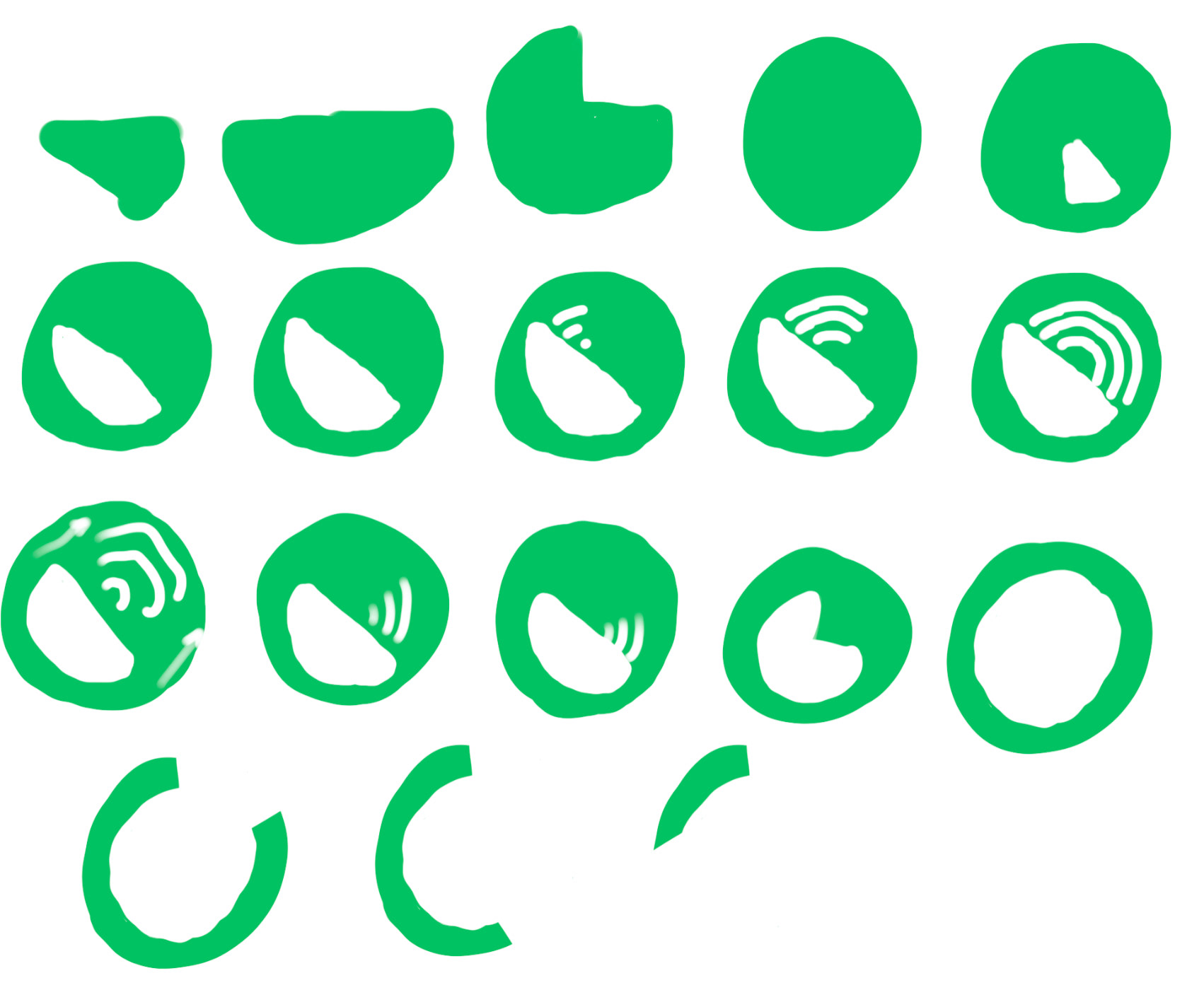
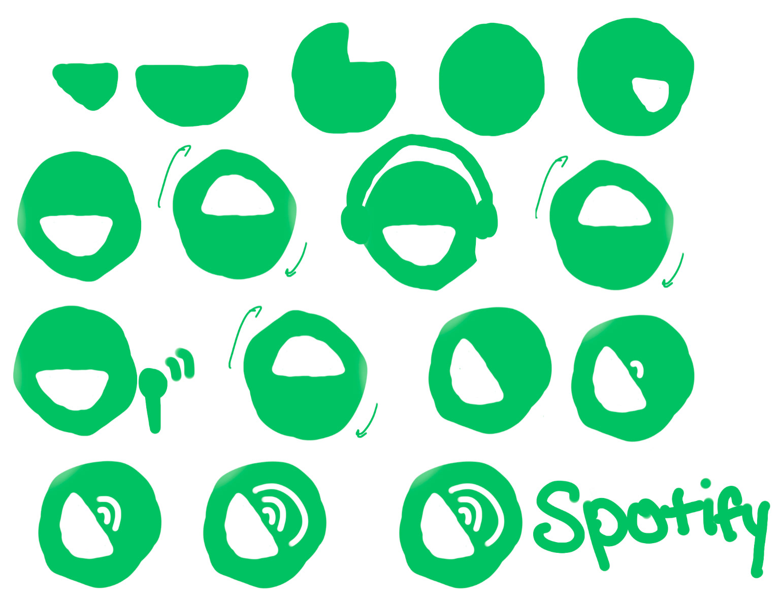
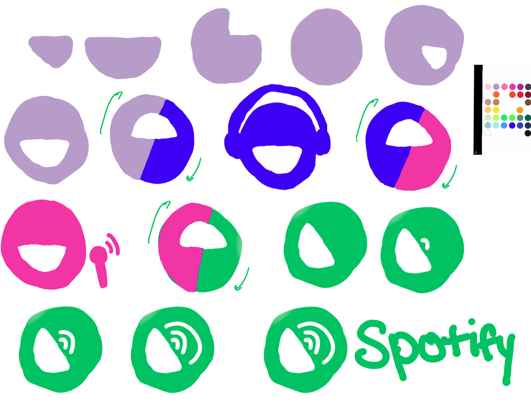
Once I decided on a brand mark, I created keyframes for one unexpected animation and one unexpected animation. I originally was going to use some of Spotify's secondary colors for the unexpected animation but decided against it to remain consistent and to keep the strongest relationship between the symbols.


Keyframe sketches for each animation
Reflection
This project was created using both Adobe Illustrator and Adobe After Effects. This was only my second project that used After Effects so I was still getting used to the software. As I reflect on this project over a year later, if I were to do this project again I would be more adventurous in my redesign of the brand mark and colors. Although I do think keeping each element green as they changed in the unexpected animation brought consistency, it would have been more unexpected had the colors not immediately reflected the main color of the brand.