The Ohio State University | Intermediate Visual Communication Design 2 | Spring 2023
Description
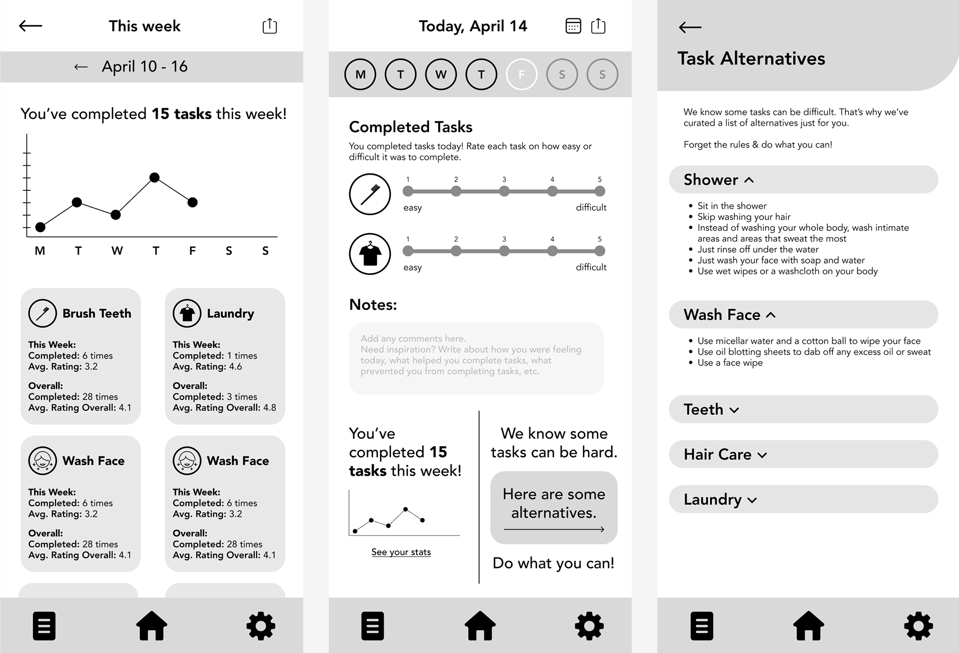
In this project, I developed the dashboard for an app concept I came up with. The app is to help individuals who have mental illnesses that cause them to struggle to maintain their physical hygiene. The dashboard is meant to motivate and support them, by keeping track of their daily stats, allowing them to log how easy/difficult a task was, allowing them to log any notes for the day, and providing them with alternatives to help them complete physical hygiene tasks.
Process
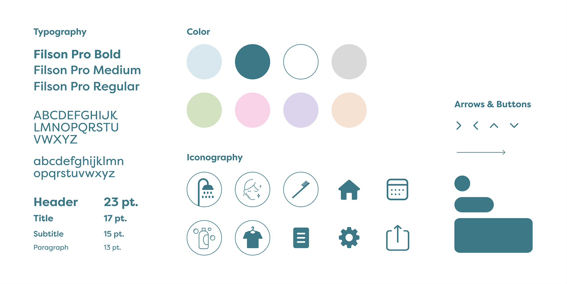
I started this project by sketching a few layout options for my dashboard. Based on the sketches, I created greyscale wireframes. I sent a first-click test to around 10 people in order to validate and refine my layouts. I then developed the visual language for the dashboard. I wanted a tone, typeface, and color palette that is supportive and uplifting.
I went through a few iterations of data visualization methods. The most challenging data to display was the data on the stats page. My initial iteration split the data between each task and just stated the number of times the user completed the task overall and for that week, as well as their average rating for that task for the week and overall. I then updated it to be a chart that showed all of the data side by side so the user could compare data and over time see trends in how they're doing (ex. this task is becoming easier/harder, this task was really easy/hard this week, etc.). I realized this was still hard to compare overall and was still telling the user the data instead of showing them. I ended up revising the chart again to display a bar graph that would easily allow the user to compare all of their average ratings of a task for that week and overtime. I also moved the "times completed" to its own data set because I thought it would be easier to view on its own and more clearly as the user clicks between days.
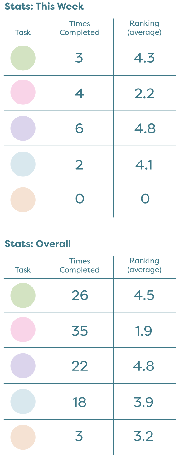
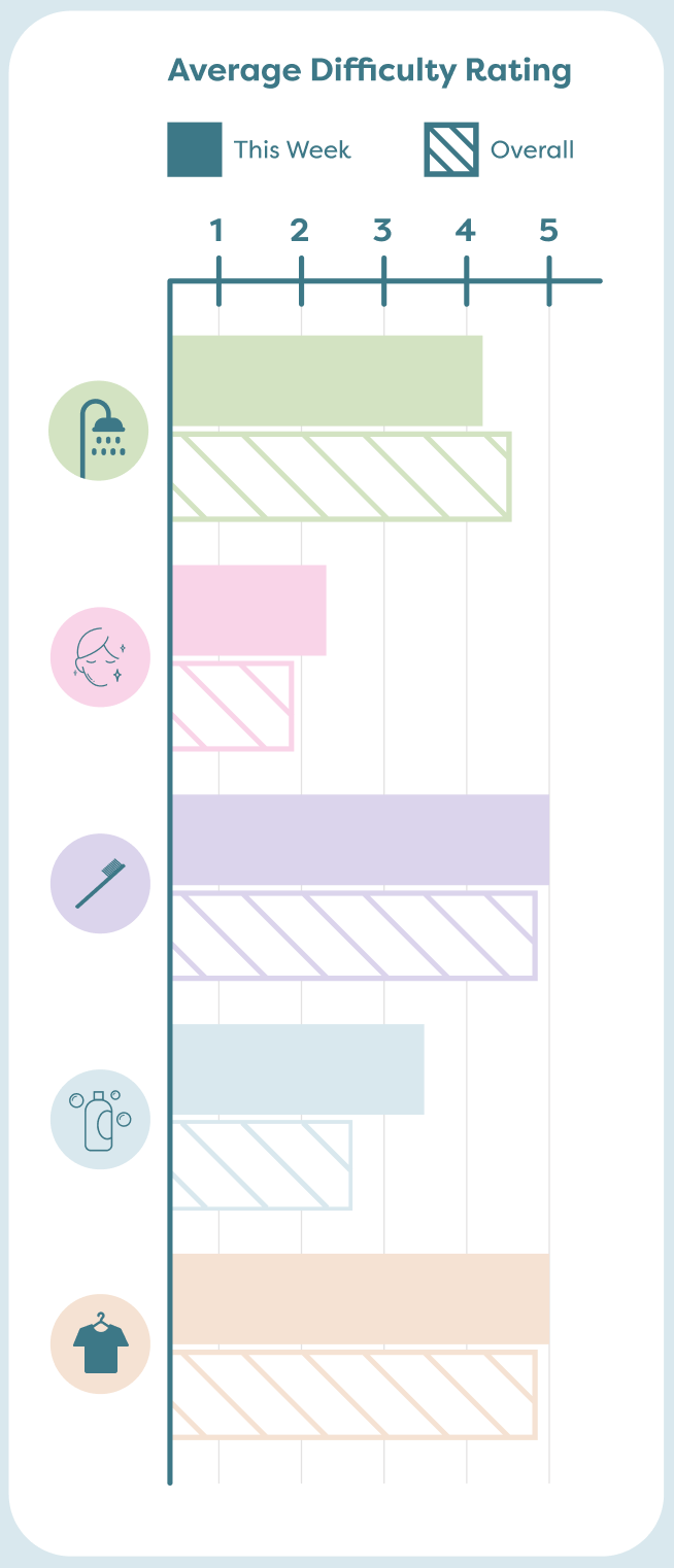
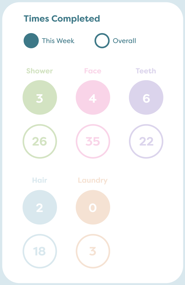
Left to right: Greyscale Wireframes, Stats Graph Iteration 2; Stats Graph Iteration 3
Reflection
If I were to continue this project, I would like to get more involved in the interactions of the app and spend more time working in Figma. Creating the full app/interactions was out of the scope of the project which is why I couldn't do it. If I were to do this project again, I would try to come up with an app that has more data overall so I could figure out how to fit a lot of data on one dashboard. I would also like to explore creating the same dashboard for different screen sizes (phone, iPad, desktop).